

スポンサーリンク
みなさんはEXCELでグラフを編集しますか?
結構手間と時間がかかりますよね。
一瞬でグラフを美しくリデザインするVBAプログラムを組んでみました!
初心者なので、とりあえず動作確認できたというレベルですが。。。
今回は、伝わるデザインさんのグラフを参考にさせてもらいました。
スポンサーリンク
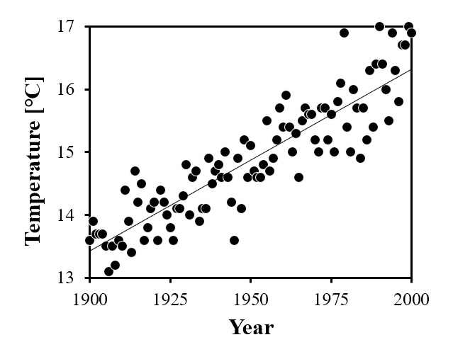
散布図グラフを美しくするVBAプログラム(1)

元データ:気象庁HPの1900年~2018年の東京の年平均気温
横軸:西暦、 縦軸:平均気温、 その他特に指定なし。
それを以下のようなグラフに編集します。
以下のVBAプログラムを実行すると一瞬でリデザインされます。
Sub Graph()

'<< グラフエリア枠線 >>
    ActiveChart.ChartArea.Format.Line.Visible = msoFalse

'<< プロットエリア枠線 >>
    ActiveChart.PlotArea.Format.Line.Style = msoLineSingle
    ActiveChart.PlotArea.Format.Line.Visible = True
    ActiveChart.PlotArea.Format.Line.Weight = 1.5
    ActiveChart.PlotArea.Format.Line.ForeColor.RGB = RGB(0, 0, 0)

'<< グラフエリアサイズ調整 >>
    ActiveChart.ChartArea.Height = 250
    ActiveChart.ChartArea.Width = 300

'<< プロットエリアサイズ調整 >>
    ActiveChart.PlotArea.Height = 195
    ActiveChart.PlotArea.Width = 255

'<< プロットエリア描画位置 >>
    ActiveChart.PlotArea.Top = 10
    ActiveChart.PlotArea.Left = 40

'<< マーカーの設定 >>
    ActiveChart.SeriesCollection(1).MarkerSize = 7
    ActiveChart.SeriesCollection(1).MarkerStyle = xlMarkerStyleCircle
    ActiveChart.SeriesCollection(1).MarkerForegroundColor = RGB(255, 255, 255)
    ActiveChart.SeriesCollection(1).MarkerBackgroundColor = RGB(0, 0, 0)

'<< 目盛の縦横軸線の設定 >>
    ActiveChart.Axes(xlCategory).HasMajorGridlines = False
    ActiveChart.Axes(xlValue).HasMajorGridlines = False

'<< 目盛線の設定 >>
    ActiveChart.Axes(xlCategory).MajorTickMark = xlOutside
    ActiveChart.Axes(xlValue).MajorTickMark = xlOutside

'<< 縦軸・横軸の目盛線 >>
    ActiveChart.Axes(xlCategory).MajorTickMark = xlTickMarkOutside
    ActiveChart.Axes(xlValue).MajorTickMark = xlTickMarkOutside

'<< 縦軸・横軸のラベル表記 >>
    ActiveChart.Axes(xlCategory).HasTitle = True
    ActiveChart.Axes(xlCategory).AxisTitle.Text = "Year"
    ActiveChart.Axes(xlValue).HasTitle = True
    ActiveChart.Axes(xlValue).AxisTitle.Text = "Temperature [℃]"

'<< 縦軸・横軸のラベルフォント >>
    ActiveChart.Axes(xlCategory).AxisTitle.Font.Name = "Times New Roman"
    ActiveChart.Axes(xlCategory).AxisTitle.Font.Size = 15
    ActiveChart.Axes(xlCategory).AxisTitle.Font.Color = RGB(0, 0, 0)
    ActiveChart.Axes(xlValue).AxisTitle.Font.Name = "Times New Roman"
    ActiveChart.Axes(xlValue).AxisTitle.Font.Size = 15
    ActiveChart.Axes(xlValue).AxisTitle.Font.Color = RGB(0, 0, 0)

'<< 縦軸・横軸のラベル位置の微調整 >>
    ActiveChart.Axes(xlCategory).AxisTitle.Top = 205
    'ActiveChart.Axes(xlCategory).AxisTitle.Left = 152
    'ActiveChart.Axes(xlValue).AxisTitle.Top = 40
    ActiveChart.Axes(xlValue).AxisTitle.Left = 15


'<< 縦軸・横軸のラベルフォント太字設定 >>
    ActiveChart.Axes(xlCategory).AxisTitle.Font.Bold = True
    ActiveChart.Axes(xlValue).AxisTitle.Font.Bold = True

'<< 縦軸・横軸の軸線 >>
    ActiveChart.Axes(xlCategory).Format.Line.Visible = msoTrue
    ActiveChart.Axes(xlValue).Format.Line.Visible = msoTrue

'<< 縦軸・横軸のスケール >>
    ActiveChart.Axes(xlCategory).MinimumScale = 1900
    ActiveChart.Axes(xlCategory).MaximumScale = 2000
    ActiveChart.Axes(xlCategory).MajorUnit = 25
    ActiveChart.Axes(xlValue).MinimumScale = 13
    ActiveChart.Axes(xlValue).MaximumScale = 17
    ActiveChart.Axes(xlValue).MajorUnit = 1

'<< 縦軸・横軸のスケールフォント >>
    ActiveChart.Axes(xlCategory).TickLabels.Font.Name = "Times New Roman"
    ActiveChart.Axes(xlCategory).TickLabels.Font.Size = 12
    ActiveChart.Axes(xlCategory).TickLabels.Font.Color = RGB(0, 0, 0)
    ActiveChart.Axes(xlValue).TickLabels.Font.Name = "Times New Roman"
    ActiveChart.Axes(xlValue).TickLabels.Font.Size = 12
    ActiveChart.Axes(xlValue).TickLabels.Font.Color = RGB(0, 0, 0)

'<< 縦軸・横軸の目盛線の太さと色 >>
    ActiveChart.Axes(xlCategory).Format.Line.Weight = 1.5
    ActiveChart.Axes(xlCategory).Format.Line.ForeColor.RGB = RGB(0, 0, 0)
    ActiveChart.Axes(xlValue).Format.Line.Weight = 1.5
    ActiveChart.Axes(xlValue).Format.Line.ForeColor.RGB = RGB(0, 0, 0)

'<< 近似曲線の追加と設定 >>
    ActiveChart.SeriesCollection(1).Trendlines.Add
    ActiveChart.SeriesCollection(1).Trendlines(1).Format.Line.Style = msoLineSingle
    ActiveChart.SeriesCollection(1).Trendlines(1).Format.Line.DashStyle = msoLineSolid
    ActiveChart.SeriesCollection(1).Trendlines(1).Format.Line.ForeColor.RGB = RGB(0, 0, 0)
    ActiveChart.SeriesCollection(1).Trendlines(1).Format.Line.Weight = 0.5

End Sub
散布図グラフを美しくするVBAプログラム(2)

元データ:総務省統計局の身長と体重の平均値(平成24年)
横軸:年齢、 縦軸:平均身長、 その他特に指定なし。
それを以下のようなグラフに編集します。
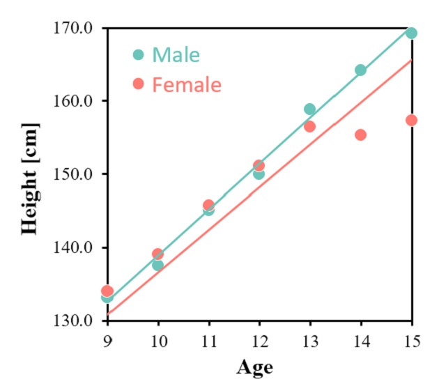
以下のVBAプログラムを実行すると一瞬でリデザインされます。
Sub Graph()

'<< グラフエリア枠線 >>
    ActiveChart.ChartArea.Format.Line.Visible = msoFalse

'<< プロットエリア枠線 >>
    ActiveChart.PlotArea.Format.Line.Style = msoLineSingle
    ActiveChart.PlotArea.Format.Line.Visible = True
    ActiveChart.PlotArea.Format.Line.Weight = 1.5
    ActiveChart.PlotArea.Format.Line.ForeColor.RGB = RGB(0, 0, 0)

'<< グラフエリアサイズ調整 >>
    ActiveChart.ChartArea.Height = 270
    ActiveChart.ChartArea.Width = 300

'<< プロットエリアサイズ調整 >>
    ActiveChart.PlotArea.Height = 225
    ActiveChart.PlotArea.Width = 255

'<< プロットエリア描画位置 >>
    ActiveChart.PlotArea.Top = 10
    ActiveChart.PlotArea.Left = 40

'<< マーカーの設定 >>
    ActiveChart.SeriesCollection(1).MarkerSize = 9
    ActiveChart.SeriesCollection(1).MarkerStyle = xlMarkerStyleCircle
    ActiveChart.SeriesCollection(1).MarkerForegroundColor = RGB(255, 255, 255)
    ActiveChart.SeriesCollection(1).MarkerBackgroundColor = RGB(106, 196, 186)

    ActiveChart.SeriesCollection(2).MarkerSize = 9
    ActiveChart.SeriesCollection(2).MarkerStyle = xlMarkerStyleCircle
    ActiveChart.SeriesCollection(2).MarkerForegroundColor = RGB(255, 255, 255)
    ActiveChart.SeriesCollection(2).MarkerBackgroundColor = RGB(255, 122, 114)

'<< 系列の名前 >>
    ActiveChart.SeriesCollection(1).Name = "Male"
    ActiveChart.SeriesCollection(2).Name = "Female"

'<< 目盛の縦横軸線の設定 >>
    ActiveChart.Axes(xlCategory).HasMajorGridlines = False
    ActiveChart.Axes(xlValue).HasMajorGridlines = False

'<< 目盛線の設定 >>
    ActiveChart.Axes(xlCategory).MajorTickMark = xlOutside
    ActiveChart.Axes(xlValue).MajorTickMark = xlOutside

'<< 縦軸・横軸の目盛線 >>
    ActiveChart.Axes(xlCategory).MajorTickMark = xlTickMarkOutside
    ActiveChart.Axes(xlValue).MajorTickMark = xlTickMarkOutside

'<< 縦軸・横軸のラベル表記 >>
    ActiveChart.Axes(xlCategory).HasTitle = True
    ActiveChart.Axes(xlCategory).AxisTitle.Text = "Age"
    ActiveChart.Axes(xlValue).HasTitle = True
    ActiveChart.Axes(xlValue).AxisTitle.Text = "Height [cm]"

'<< 縦軸・横軸のラベルフォント >>
    ActiveChart.Axes(xlCategory).AxisTitle.Font.Name = "Times New Roman"
    ActiveChart.Axes(xlCategory).AxisTitle.Font.Size = 15
    ActiveChart.Axes(xlCategory).AxisTitle.Font.Color = RGB(0, 0, 0)
    ActiveChart.Axes(xlValue).AxisTitle.Font.Name = "Times New Roman"
    ActiveChart.Axes(xlValue).AxisTitle.Font.Size = 15
    ActiveChart.Axes(xlValue).AxisTitle.Font.Color = RGB(0, 0, 0)

'<< 縦軸・横軸のラベル位置の微調整 >>
    ActiveChart.Axes(xlCategory).AxisTitle.Top = 233
    'ActiveChart.Axes(xlCategory).AxisTitle.Left = 152
    'ActiveChart.Axes(xlValue).AxisTitle.Top = 40
    ActiveChart.Axes(xlValue).AxisTitle.Left = 15


'<< 縦軸・横軸のラベルフォント太字設定 >>
    ActiveChart.Axes(xlCategory).AxisTitle.Font.Bold = True
    ActiveChart.Axes(xlValue).AxisTitle.Font.Bold = True

'<< 縦軸・横軸の軸線 >>
    ActiveChart.Axes(xlCategory).Format.Line.Visible = msoTrue
    ActiveChart.Axes(xlValue).Format.Line.Visible = msoTrue

'<< 縦軸・横軸のスケール >>
    ActiveChart.Axes(xlCategory).MinimumScale = 9
    ActiveChart.Axes(xlCategory).MaximumScale = 15
    ActiveChart.Axes(xlCategory).MajorUnit = 1
    ActiveChart.Axes(xlValue).MinimumScale = 130
    ActiveChart.Axes(xlValue).MaximumScale = 170
    ActiveChart.Axes(xlValue).MajorUnit = 10

'<< 縦軸・横軸のスケールフォント >>
    ActiveChart.Axes(xlCategory).TickLabels.Font.Name = "Times New Roman"
    ActiveChart.Axes(xlCategory).TickLabels.Font.Size = 12
    ActiveChart.Axes(xlCategory).TickLabels.Font.Color = RGB(0, 0, 0)
    ActiveChart.Axes(xlValue).TickLabels.Font.Name = "Times New Roman"
    ActiveChart.Axes(xlValue).TickLabels.Font.Size = 12
    ActiveChart.Axes(xlValue).TickLabels.Font.Color = RGB(0, 0, 0)

'<< 縦軸・横軸の目盛線の太さと色 >>
    ActiveChart.Axes(xlCategory).Format.Line.Weight = 1.5
    ActiveChart.Axes(xlCategory).Format.Line.ForeColor.RGB = RGB(0, 0, 0)
    ActiveChart.Axes(xlValue).Format.Line.Weight = 1.5
    ActiveChart.Axes(xlValue).Format.Line.ForeColor.RGB = RGB(0, 0, 0)

'<< 近似曲線の追加と設定 >>
    ActiveChart.SeriesCollection(1).Trendlines.Add
    ActiveChart.SeriesCollection(1).Trendlines(1).Format.Line.Style = msoLineSingle
    ActiveChart.SeriesCollection(1).Trendlines(1).Format.Line.DashStyle = msoLineSolid
    ActiveChart.SeriesCollection(1).Trendlines(1).Format.Line.ForeColor.RGB = RGB(106, 196, 186)
    ActiveChart.SeriesCollection(1).Trendlines(1).Format.Line.Weight = 1.5

    ActiveChart.SeriesCollection(2).Trendlines.Add
    ActiveChart.SeriesCollection(2).Trendlines(1).Format.Line.Style = msoLineSingle
    ActiveChart.SeriesCollection(2).Trendlines(1).Format.Line.DashStyle = msoLineSolid
    ActiveChart.SeriesCollection(2).Trendlines(1).Format.Line.ForeColor.RGB = RGB(255, 122, 114)
    ActiveChart.SeriesCollection(2).Trendlines(1).Format.Line.Weight = 1.5

'<< 凡例の設定 >>
    ActiveChart.HasLegend = True
    ActiveChart.Legend.Font.Size = 16
    ActiveChart.Legend.Top = 25
    ActiveChart.Legend.Left = 80
    ActiveChart.Legend.Height = 40
    ActiveChart.Legend.LegendEntries(4).Delete
    ActiveChart.Legend.LegendEntries(3).Delete
    ActiveChart.Legend.LegendEntries(1).Font.Color = RGB(106, 196, 186)
    ActiveChart.Legend.LegendEntries(2).Font.Color = RGB(255, 122, 114)

End Sub
最後に
コピペして利用される際には、適宜修正してお使いください。
縦横軸の上下限値や軸名なども書き換わってしまいますので。
動作確認環境は、EXCEL2016となります。
スポンサーリンク
スポンサーリンク